
Data-Driven Assistance Systems in the Working Environment |
Efficient development of target group-specific BI dashboards in companies
| Journal | Industry 4.0 Science |
| Issue | Volume 41, 2025, Edition 5, Pages 136-143 |
| Open Access | https://doi.org/10.30844/I4SE.25.5.130 |
| Bibliography | Share | Cite | Download |
Abstract
Keywords
Article
This article reports on initial findings from action research [1] on the implementation of digital assistance systems in four pilot cases as part of the project “PerspektiveArbeit Lausitz”. It examines how systematic development can prevent bad investments or project cancellations.
Initial situation: Lack of BI tools for data visualization
In the data-driven world of work, accurate and timely information is essential for sound decision-making and competitiveness. Business intelligence (BI) dashboards play a key role in this. BI tools, such as Tableau, consolidate data from various software programs in use within companies, for example for order management or production data acquisition, and enable analyses of patterns and trends, transforming complex data sets into dashboards.
In this way, they make an important contribution to sound business decisions, either on the basis of real-time data evaluations or by integrating data from different sources for the optimization of processes and decision support [2-5]. Dashboards facilitate communication between departments by providing all participants with the same overview of relevant data. This promotes alignment on goals and improves coordination within the company.
However, every company has specific requirements for data visualization and reporting. Dashboards must therefore be customizable to provide exactly the information that is most relevant to the company in question. Designing dashboards independently reduces reliance on external service providers or proprietary solutions, on the one hand. On the other hand, however, it constitutes a challenging process that can only be carried out by those with adequate skills and resources for implementation. As pilot cases show, many SMEs are currently overwhelmed by this prospect.
The four pilot companies reported on here demonstrate a high degree of dependence on available IT capacities (for example Group IT) and on the willingness of external IT service providers to give access to their underlying data and metadata. While the EU Data Act [6] grants users of software formal rights with regard to transparency and data access, these rights are currently claimed only hesitantly. High-quality BI dashboard solutions incur considerable licensing and implementation costs. The risk of a bad investment therefore represents a further hurdle for smaller companies. Co-creation by companies and academia brings together different areas of expertise, helping to minimize risk.
The pilot companies do not currently use any BI tools for data visualization. Instead, dedicated employees create their own diagrams using office software, most often Microsoft Excel. Obtaining and processing data from various source systems involves considerable manual effort. The limited functionality of Excel, the often-restricted data access, and the resulting manual replacement of missing data can lead to distorted visualizations.
Data modeling is extremely challenging: employees often lack either the knowledge to model business processes and the associated data collection or access to the company data stocks, which would have to be provided by the suppliers. Inconsistent or incorrect data from different systems leads to reduced data quality and significantly impairs the accuracy of dashboards. These issues often occur due to gaps and deviations in the organizational processes for data collection.
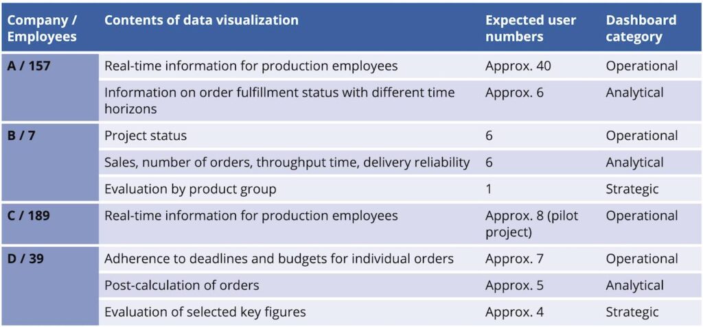
The scope and design of dashboards is largely determined by their intended use [7]. Relevant use cases in the pilot companies are:
- Operational dashboards for monitoring daily business processes using real-time data
- Analytical dashboards for deriving trends and patterns from historical data
- Strategic dashboards that provide an aggregated view of long-term performance and the fulfillment of strategic goals
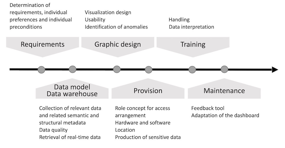
The systematic preparation of the development process and the experience gained from action research in the pilot companies since 2022 shows several interconnected complexes that must be addressed (to varying degrees) to create an effective dashboard tailored to the conditions at the respective company (Fig. 2).
Findings from the dashboard development process
Dashboard development took place in the pilot companies as a cooperative, interdisciplinary project involving company employees and scientists from the fields of computer science and ergonomics. The first step was to identify specific user requirements and define the goals to be achieved with the dashboard. This ensures that the solutions meet user needs and are accepted.
For the operational dashboards, guided expert interviews were carried out and the results validated in group discussions. Guided expert interviews are a good way to gain deeper insights into user needs and expectations, whilst group workshops offer a platform for users to share ideas and discuss requirements. Group discussions proved to be an effective tool for the creation of analytical dashboards, as all statements made by participants could be documented and processed.
The requirements formulated by potential users are recorded in a requirements document. Mock-ups of the dashboards can help users in this development step to specify their requirements (see [8]). In the pilot companies, although no mock-ups were used, prototypes tailored to the specific business case were implemented immediately after data access was ensured and were iteratively revised from that point on. This approach can pose challenges for the developer, whose design is repeatedly questioned and sent back for revision and expansion. It therefore makes sense to “freeze” an agreed scope of functions at a certain stage of development. Further revisions or expansions should only be initiated after a test phase.
A prerequisite for visualization is a data model of the company that maps the data sets of the BI software as well as the existing relationships between them. As already described, formulating this represents a major challenge for many companies. A combination of business process and data modeling has proven effective for developing, clarifying and continuously expanding such a data model. The work processes of individual employees at the pilot companies were used as a starting point to determine the data analysis requirements specific to their tasks and to identify the necessary data structures. Flowcharts supplemented with data input and output, for example using Business Process Modeling Notation (BPMN), are suitable for documentation.
The detailed specification of the requirements for the dashboard requires an iterative process involving all relevant employees, as initial data evaluations are often based on implicit knowledge. The expert discussions and workshops conducted showed that it is difficult for employees to explain their thought processes. They are required to put themselves in the position of other employees, including those from other departments. In this context, it also makes sense to collect typical value ranges for recorded data in order to formulate rules for any necessary alarm messages or for identifying outliers. The direct involvement of dashboard developers at this stage is extremely useful for the direct exchange of information and knowledge, for example for clarifying the available options.
Once the relevant processes and data elements have been identified and their relationships clarified, the associated data sources are examined. Numerous “data islands”, i.e., task-specific data sets, were found in all pilot companies.
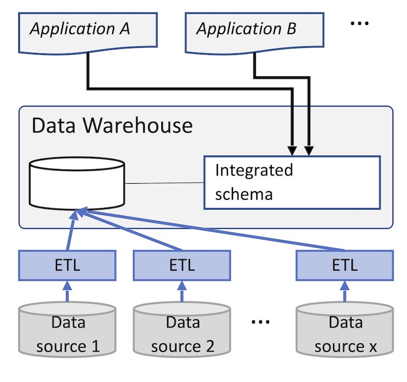
However, for technical or organizational reasons, these are, in most cases, not linked, which is necessary for most dashboard solutions. For this reason, the concept of a data warehouse [9] was implemented in the companies. This is usually a relational database that acts as the central data source for a number of dashboards. In the data warehouse, the necessary data from the various source systems of the company is consolidated and transferred to an integrated database schema suitable for the dashboard (Fig. 3).
Depending on the requirements, it may be necessary to expand data collection within companies. This can be done, for example, by introducing sensor technology for automatic data collection, reading data from machine controls, or using data collection tools for employees.
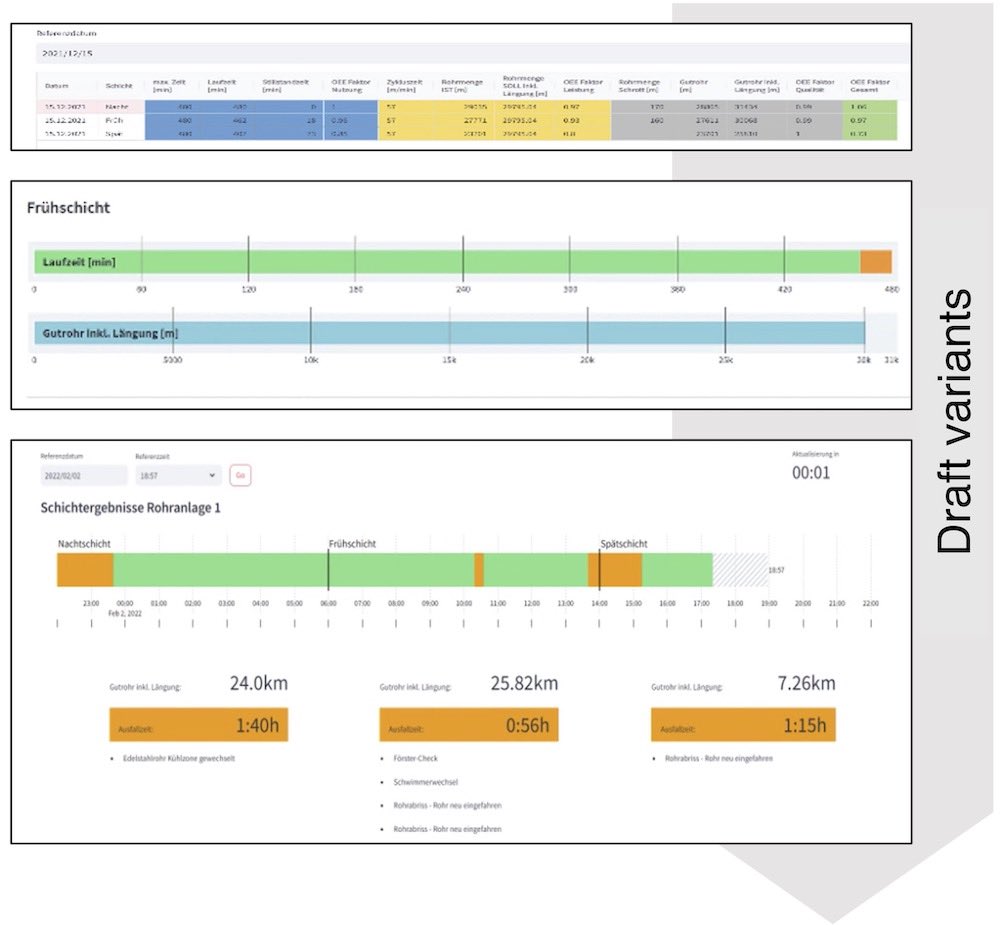
Open-source software was used in the pilot companies to create the dashboards themselves. A well-designed dashboard enables users to quickly grasp complex information and gain valuable insights. There are a wealth of templates [12] and selection recommendations [13-17] for this procedure [10, 11], for the layout of a dashboard and for the selection and design of diagrams. Issues of usability and comprehensibility are laid out in standards (for example DIN EN ISO 9241 [18]).
In the pilot companies, simple representations are used initially. Designs with different forms of representation are discussed with the users (see example in Fig. 4).
The dashboards are made available via a web browser on the respective intranet. This mode ensures low-threshold access, allows for easy central administration, and does not require separate software installations on various end devices.
The location of the display depends on the intended use. In company C, the dashboard conveying real-time production parameters, aimed at motivating machine operators and thereby improving performance, is displayed on a large screen in the workplace. In company A, a measuring station visited by the plant operators every time there is a change of order is equipped with a monitor for display. Analytical dashboards, for monitoring current work planning, for example, are used on the PCs of the responsible persons. These are also equipped with interaction functionality (drill-down principle), for example, for filtering by time period. Compliance with the GDPR [19] was taken into account in the respective visualization.
Expected changes in work activities
A clear positive change in the pilot companies is faster data access and automated reporting. In case A, charts for employee information, which used to take 15-45 minutes per day to create, are now available at the touch of a button. The same applies to case D, where employees used to go through the laborious process of exporting data from various BI software solutions, merging it in Excel, and continually updating it. This noticeable increase in efficiency contributes to acceptance by both those employees directly involved and also those indirectly involved.
The system’s use and usability will initially be evaluated using questionnaires after a test period of approximately four weeks (depending on frequency of use) and the solution revised accordingly. After a period of use lasting several months, questionnaires and guided interviews will be used to assess the qualitative changes in work activities in terms of productivity, task content, changes in workload, and required skills.
Expected results:
- Shorter response times and increased productivity through real-time access to information
- Freedom to complete the actual work task (it should be noted that the elimination of this task could also have a negative effect if no adequate replacement is provided)
- New opportunities offered by the system, for example the use of machine learning to identify trends and correlations
- Larger group of people involved in data analysis (not just specialists); therefore, training is expected to ensure that employees interpret the data correctly
Limitations of the investigation
Since the implementation process under investigation is not yet complete, the findings mentioned above are preliminary. A further limitation arises from the specific nature of the action research approach, which means that the results are not necessarily universally valid [20]. A meta-study covering a total of ten company cases is therefore planned for the end of the project. It will follow a mixed-method approach [21] and analyze further implementation cases of digital assistance systems using a self-defined set of use case characteristics in order to derive qualitatively valid statements.
The increasing importance of dashboards
Based on the findings from these specific pilot cases, this article highlighted the complex challenges to be overcome on the path to data visualization using dashboards. However, given the wide range of data visualization tools available and the implementation possibilities of generative AI systems [22], a shift in focus toward requirements analysis, data modeling, and the establishment of data warehouses can be expected.
These aspects are crucial for creating a solid foundation for effective data visualizations. The article also supports the derivation of well-founded recommendations for subsequent research work. These are necessary in order to examine in detail the effects of dashboards on the productivity of companies, as well as changes in workflows, work activities and associated competence requirements, and influencing factors in the implementation process.
The Regional Competence Center for Labor Research “PAL – Perspektive Arbeit Lausitz” is funded by the Federal Ministry of Education and Research under the funding code 02L19C301, project duration: November 1, 2021– October 31, 2026, for which we are grateful.
The original German version of this article can be accessed via DOI: 10.30844/I4SD.25.5.136
Bibliography
[1] Di Giulio, A.; Defila, R. (eds.): Transdisziplinär und transformativ forschen. Wiesbaden 2018.[2] Zhang, Q.: The Impact of Interactive Data Visualization on Decision-Making in Business Intelligence. In: Advances in Economics, Management and Political Sciences 87 (2024) 1, pp. 166-171.
[3] Perkhofer, L.; Eisl, C.; Teufl, J.; Hofer, P.: Komplexitätsreduktion im Nachhaltigkeitsreporting durch richtiges Dashboard Design. Conference proceedings CARF Lucerne 2024.
[4] Perkhofer, L. M.; Hofer, P.; Walchshofer, C.; Plank, T.; Jetter, H.-C.: Interactive visualization of big data in the field of accounting: A survey of current practice and potential barriers for adoption. In: Journal of Applied Accounting Research 20 (2019) 4, pp. 497-525.
[5] Sproten, A. N.: Datenvisualisierung und Business Intelligence – Methoden zur Unterstützung der Entscheidungsfindung. In: Halfmann M.; Schüller K. (eds.): Marketing Analytics. Wiesbaden 2022, pp. 139-159.
[6] Lober, A.; Kriebel, L.: Der Data Act und seine Auswirkungen: Was Sie wissen müssen. Industry of Things 2024. URL: https://www.industry-of-things.de/data-act-wirkung-auf-vernetzte-produkte-a-6ea00d2316e25b197672abe807d3eead/, accessed 21.06.2025.
[7] UXPin. Effective Dashboard Design Principles for 2025. Studio by UXPin 2025. URL: https://www.uxpin.com/studio/blog/dashboard-design-principles/, accessed 21.06.2025.
[8] Corr, L.; Stagnitto, J.: Agile data warehouse design: collaborative dimensional modeling, from whiteboard to star schema. rev. ed. Leeds 2014.
[9] Inmon, W. H.: Building the Data Warehouse Fourth Edition. 4th ed. Indianapolis, Indiana 2005.
[10] Schulz, A.-K.; Proff, D. U.: Datenvisualisierung und Dashboards. In: Wesselmann, M. (ed): Content gekonnt: Strategie, Organisation, Umsetzung, ROI-Messung und Fallbeispiele aus der Praxis. Wiesbaden 2020, pp. 295-322.
[11] Jacobs, L.; Hensel-Börner, S.: The Die Kraft effektiver Daten-Visualisierung – CLEAR(I): Ein Leitfaden zur wirkungsvollen Dashboard-Gestaltung. In: Boßow-Thies, S.; Hofmann-Stölting, C.; Jochims, H. (eds.): Data-driven Marketing: Insights aus Wissenschaft und Praxis. Wiesbaden 2020, pp. 43-75.
[12] Hichert, R.; Faisst, J.: Notationsstandards in der Geschäftskommunikation und deren praktischer Nutzen. 2014. URL: https://ibcs.com/wp-content/uploads/2016/09/SAP-IBCS-white-paper_deutsch_2014-06-18.pdf, accessed 21.06.2025.
[13] Healy, C.; Holtz, Y.: From data to Viz | Find the graphic you need n.d. URL: https://www.data-to-viz.com/data-to-viz.com, accessed 21.06.2025.
[14] Bach, B.; Freeman, E.; Abdul-Rahman, A.; et al.: Dashboard Design Patterns. In: IEEE Transactions on Visualization and Computer Graphics (2023) 29, pp. 342-352.
[15] Tomboc, K.: 20 wichtige Diagramm Arten und ihre Verwendung. Piktochart 2021. URL: https://piktochart.com/de/blog/diagramm-arten/, accessed 21.06.2025.
[16] insightsoftware. Auswahl des richtigen Diagramms für Ihre Daten. insightsoftware 2023. URL: https://insightsoftware.com/de/blog/choosing-right-chart-data/, accessed 21.06.2025.
[17] Hofer, P.; Perkhofer, L. et al.: Interaktive Big Data Visualisierungen – Potenzial für das Management Reporting. In: Keimer, I.: Egle, U. (eds.): Die Digitalisierung der Controlling-Funktion: Anwendungsbeispiele aus Theorie und Praxis. Wiesbaden 2020, pp. 159-187.
[18] DIN Deutsches Institut für Normung e. V. (ed.): DIN EN ISO 9241-171: Ergonomie der Mensch-System-Interaktion Teil 171: Leitlinien für die Barrierefreiheit von Software (draft) 2023.
[19] Datenschutz-Grundverordnung (DSGVO) – Finaler Text der DSGVO inklusive Erwägungsgründe n.d. URL: https://dsgvo-gesetz.de/, accessed 21.06.2025.
[20] Monkevičienė, O.; Galkienė, A.: Theoretical and Methodological Validation of the Action Research: Methodology of the Scientific Study. In: Galkienė, A.; Monkevičienė, O. (eds.): Improving Inclusive Education through Universal Design for Learning. Cham 2021, pp. 59-69.
[21] Kuckartz, U.: Mixed Methods: Methodologie, Forschungsdesigns und Analyseverfahren. 2014.
[22] QLIK: Nach AI: Neue Impulse für Daten, Erkenntnisse und Maßnahmen n.d. URL: https://assets.qlik.com/image/upload/v1736788821/qlik/docs/resource-library/ebooks/resource-eb-after-ai-reinventing-data-insights-and-action-amidst-the-noise-de_qiu6a4.pdf, accessed 21.06.2025.
Your downloads
Potentials: Management Training
Solutions: Production Planning